Articles
Plutus: A New Look 👀
5 min read

Hey Plutonians!
Recently, we teased you with our upcoming brand refresh, and today, we're thrilled to pull back the curtain and unveil the secret - a brand new Plutus experience that's been months in the making!
So, what's all the buzz about? Let's dive in and explore every aspect of our brand refresh, from the revamped logo to the colour palette and everything in between.

A fresh look at our brand
Welcome to the new Plutus, where we're redefining the way you engage with your finances. Our brand refresh isn't just about aesthetics, it's about embodying our core values and connecting with you on a deeper level. Here's a sneak peek into what's changing and why it matters!
Our brand refresh isn't just a cosmetic makeover, it's a strategic move to align our visual identity with our bold vision for the future. We're bridging the gap between traditional finance and the cutting edge of crypto, and our new look reflects this fusion of innovation and accessibility.
Defining our purpose and promise.
At Plutus, we believe in liberating everyone with a rewarding and accessible financial system. Our brand purpose guides everything we do, helping us build a strong emotional connection with our community.
Our brand promise sets us apart, outlining how we achieve our purpose. And through design, we can elevate those moments of delight you feel from earning rewards.

Speaking your language.
Our voice is consistent across all channels, but our tone can flex depending on the situation. Whether it's playful, trustworthy, or easy to understand, we aim to communicate with you in a way that resonates and connects.
A symbol of recognition.
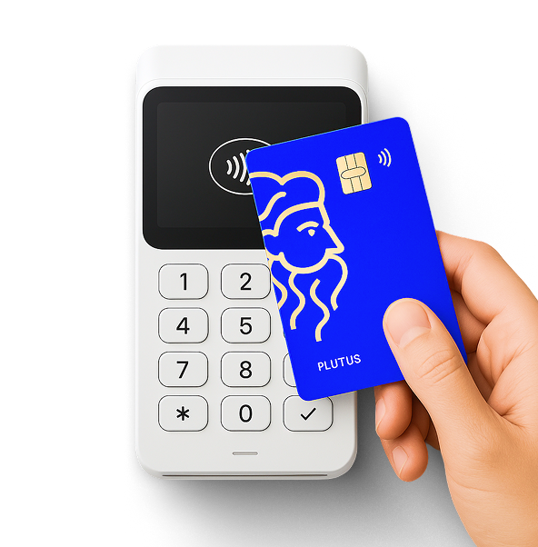
Our signature logo, the core wordmark, is the symbol of our brand. It's easily recognisable and versatile, making it perfect for our products and messaging.

Clear and legible.
We've adopted a strict typographic system to ensure consistency and legibility. Our primary typeface, Youth, embodies our brand personality, while Banana Grotesk supports in body copy.
Vibrant and versatile.
Our colour palette, featuring our iconic ocean blue, rich black, airy sky blue, and White, reflects our brand's vibrancy and versatility. These colours allow us to convey different messages while maintaining a cohesive visual identity.
Bringing our brand to life.
Illustration adds depth and character to our communications, allowing us to be adventurous and playful. Combining real-life photography with unique icons creates a dynamic visual experience that embodies Plutus’ core values.
Capturing moments, creating connections.
Photography plays a crucial role in showcasing the range of possibilities we offer and emphasises the richness of individual experiences. By capturing real people and real-life moments, we bring authenticity and warmth to our brand.

The website has already gotten a fresh new look, and next up is your favourite app! Stay tuned for more updates and sneak peeks along the way.
We partnered with Together(https://togetheragency.co.uk/), a highly skilled branding agency, to bring our vision to life. Their expertise and creativity have been instrumental in shaping the new Plutus brand experience.
We invite you to join us in experiencing the new Plutus! Let's redefine finance and create a future where everyone can be part of our community.
Your feedback is very important to us. Visit our website, follow us on social media, and let us know how our new brand experience feels to you.
Thank you for being a part of our community. Here's to new beginnings and endless possibilities with Plutus!


.png)
.png)